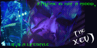
the text is horrible..not only the colour but the fact its placement is so bad. really need to work on that more, dont understand why people make sigs so big either, make them smaller its gives u a nice space to work with. make it more simple, tryin using only one image
xsophiex Member
Posts : 32 Join date : 2008-12-13 Age : 31
Subject: Re: Jeff Hardy Wed Dec 31, 2008 4:25 am
its not actually that bad. i quite like the 2 pics but the text is just ew and those lines?
thesoberdouglas Premium Member
Posts : 378 Join date : 2008-10-17 Age : 30 Location : On a giraffe
Subject: Re: Jeff Hardy Wed Dec 31, 2008 4:49 am
the text is awful, and you should stick to one image